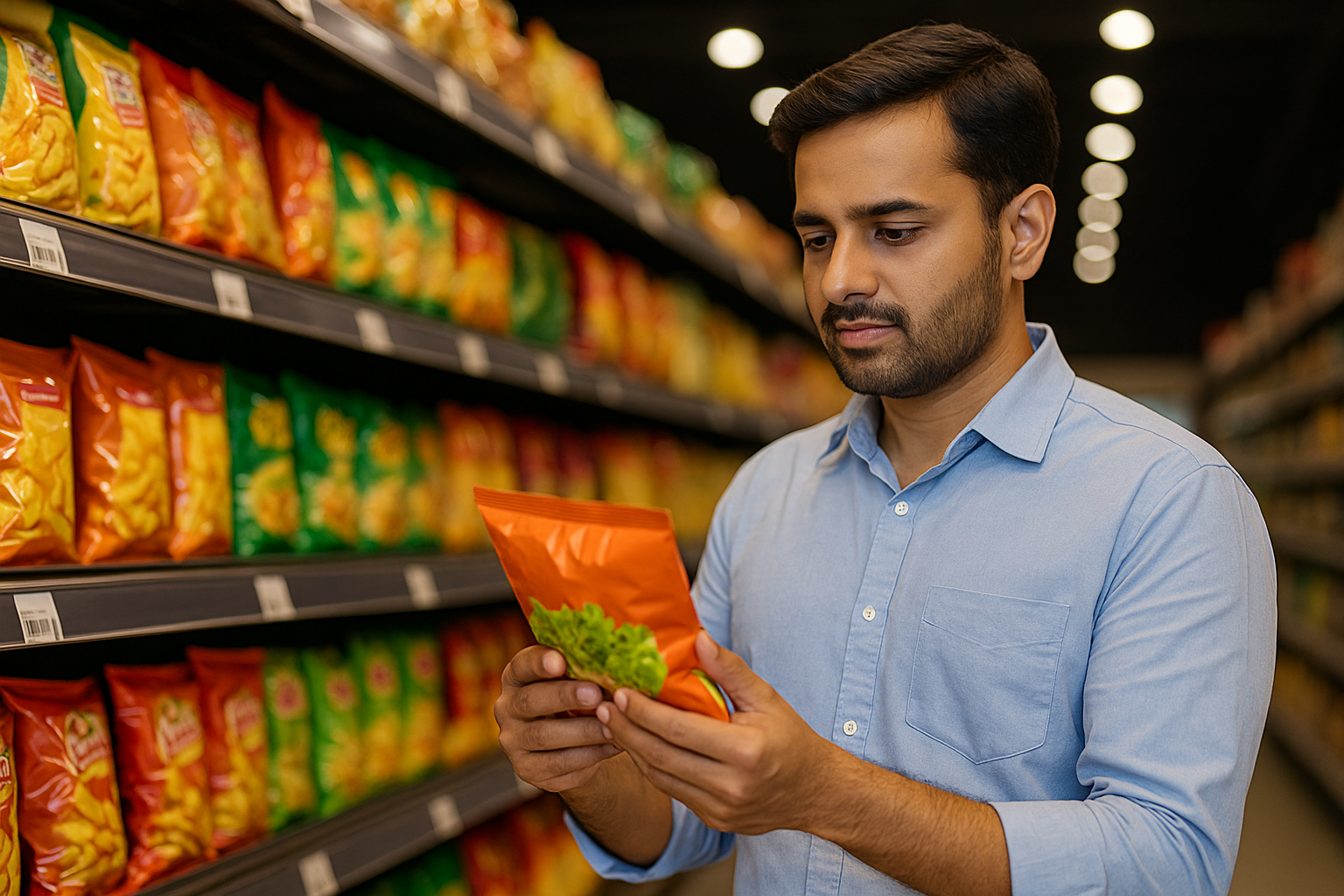
How thoughtful packaging elevates trust, shelf appeal, and consumer connection in the Indian retail landscape
In the world of consumer brands, packaging is often the first—and sometimes the only—moment you get to make an impression. For Indian consumers, who shop across kirana stores, modern trade, and digital marketplaces, design speaks before product experience does.
At EGK, we believe that great packaging isn’t just functional or pretty—it’s a strategic tool that drives connection, builds brand memory, and sparks loyalty. In a country as diverse as India, it’s not about aesthetic alone—it’s about relevance, clarity, and trust.
Design that connects isn’t just attractive. It’s effective. Here’s how.
78% of Indian consumers say they’ve chosen a product solely because of how it looked on the shelf.
Over 60% associate packaging quality with brand credibility.
In the D2C space, unboxing experiences now drive shareability and social validation.
In rural and semi-urban markets, packaging clarity influences first-time trial.
Packaging isn’t just a wrapper—it’s a salesperson, educator, and trust-builder, all in one.
Designing packaging for India is a nuanced challenge. Our consumers range from digitally savvy Gen Z to offline-first homemakers, from regional loyalists to urban samplers. At EGK, our packaging design framework is built around 5 key pillars:
Your pack has 3–5 seconds to deliver key value. Consumers want to know what it is, why it’s good, and how it works—without having to squint.
We prioritize:
Bold, functional product names
Clear benefit statements (“No preservatives”, “5-day freshness”, “100% Arabica”)
High-contrast labeling for rural readability
If they don’t get it, they won’t try it.
In India, color, iconography, and design language aren’t just about style—they’re about resonance. A turmeric-based product looks “incomplete” without warm tones. Coffee packs must signal strength or calm depending on the blend.
We tailor design based on:
Regional visual cues (e.g., South Indian filter coffee motifs vs. North Indian masala tea visuals)
Cultural expectations around trust (silver/gold accents = premium)
Festive overlays for seasonality
Familiarity invites attention. Context converts.
Many consumers now see your product for the first time on a phone screen. But it must also hold attention in a store aisle.
Our packaging is:
Digitally scannable: clean logos, mockups, and backgrounds for marketplaces
Retail-optimized: consistent color blocking for shelf stacking and recognition
WhatsApp-friendly: product shots that work in small previews
Great design today is channel-agnostic, consumer-first.
Packaging that’s easier to open, reseal, reuse, or store improves repeat purchase odds.
We often implement:
Zip-locks on spice pouches
Portion-ready sachets for coffee kits
Stackable jars that save kitchen space
When a consumer enjoys the use experience, the brand becomes a part of their routine—not just their basket.
In India, language = accessibility. Using English alone can alienate. Using only regional language can restrict. So we blend intelligently:
English + one regional language on key panels
Pictorial usage instructions for clarity
Claims supported with visible badges or certifications
We also guide tone:
Assertive for confidence (“100% Natural”)
Conversational for community brands (“Crafted with care from Coorg”)
For Kaffo, our design journey started with two insights:
Coffee drinkers in India want clarity—blend, strength, use
Shelf presence matters—especially in stores where most coffee packs look the same
Our solution:
Distinct matte finish, consistent color per blend
Roast strength indicators (1 to 5)
Side labels with brewing suggestions
QR code that leads to a video by the roaster
For evnor, our spice and condiment brand, we introduced:
Transparent windows to highlight texture
Bold local names (“Kolhapuri Masala”, “Chettinad Paste”)
A small map showing origin state for cultural anchoring
Design isn’t decoration. It’s our first handshake with a new consumer.
Don’t clutter the front panel—prioritize one clear promise
Test design with store staff—they know what sells
Rotate packaging elements seasonally to stay fresh without redoing SKUs
Invest in packaging quality early—even in small batches, perception matters
As India’s consumer base grows more discerning, packaging will become less of a cost and more of an investment. It will be expected to inform, engage, reassure, and reflect purpose—all while being sustainable.
We see rising demand for:
Minimal plastic, compostable options
Smart packs with QR-linked traceability
Hyper-personalization in D2C subscription boxes
Packs that tell stories, not just ingredients
Cillum facilisi. Proident turpis? Fringilla? Tempore potenti, voluptatum, quisque pulvinar aliqua vero, netus duiner inima bibendum id ipsum.
Give us a call !
Have a project in mind?
Copyright © 2025 EGK Enterprises. All rights reserved.